The Design System
These guidelines define how the Mel·lif·lu·ous brand should look and work across the website and other materials, including colours, fonts, logos, buttons, icons, spacing, and other visual elements. Use them whenever you create, update, or generate anything for Mel·lif·lu·ous. They are the source of truth for the Mel·lif·lu·ous visual identity and should be followed by both people and AI tools.
Built to be read by people and AI alike — a plain-text version is at /llms.txt.
What this project stands for.
Three sentences the rest of this page answers to. Every rule further down is downstream of these — if a decision does not serve one of them, it is decoration.
Purpose — the why
To make sense of the world through sound — turning place, memory and curiosity into music that lives in the space between acoustic and electronic, instinct and discipline.
Vision — the future
A practice that keeps following curiosity into unfamiliar places — new residencies, new ways of recording and performing — rather than settling into one fixed sound.
Mission — in practice
Building songs live from violin, voice and loops, shaped by where they are made — a fish factory in Iceland, a house in Itoshima — and shared as albums, an interactive installation, and an ongoing writing practice.
Voice & mood
The adjectives the work is checked against. Useful in the negative: if a draft is none of these, it is off-brand no matter which colours it uses.
A monogram and a name.
A lowercase m cut out of a filled circle, travelling two ways: the circle alone, and a horizontal lockup. Each ships in three colourways — dark, light and green — and you choose by the background it sits on, never by preference. Every file below downloads from this page.
In use
Over a photograph the light lockup sits top-left with clear space around it, and the image is chosen so nothing busy runs underneath the mark.

Horizontal
The default lockup, for headers, footers and anywhere wide. Green on light backgrounds, light on dark ones; the all-black version is there for single-colour printing and anywhere the green cannot reproduce.





Circle
The mark on its own, for avatars, favicons and anywhere square. It carries no tagline, so it stays legible far smaller than the horizontal lockup does — down to 32 px. The green circle is the site favicon.






Real photos.
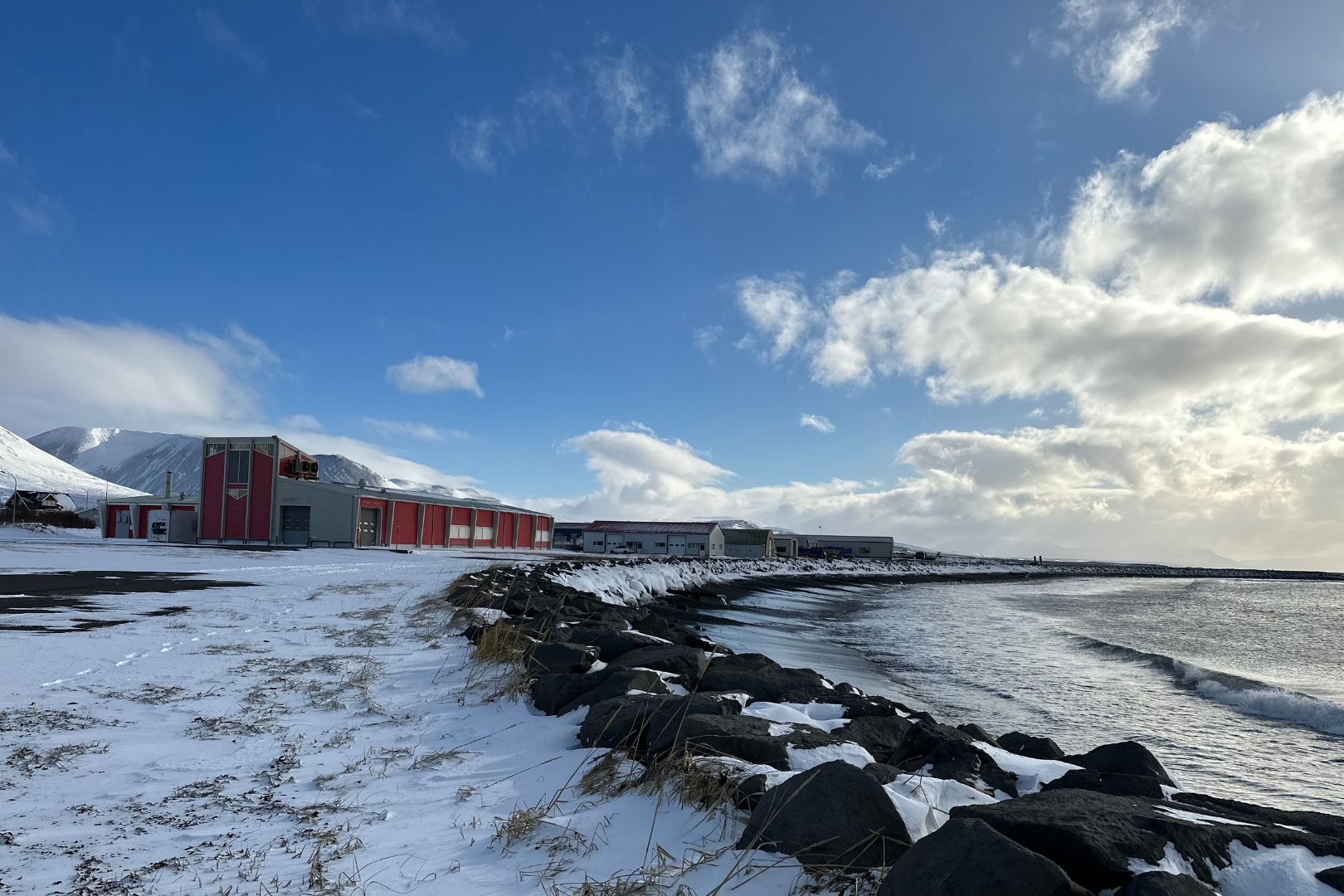
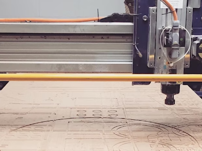
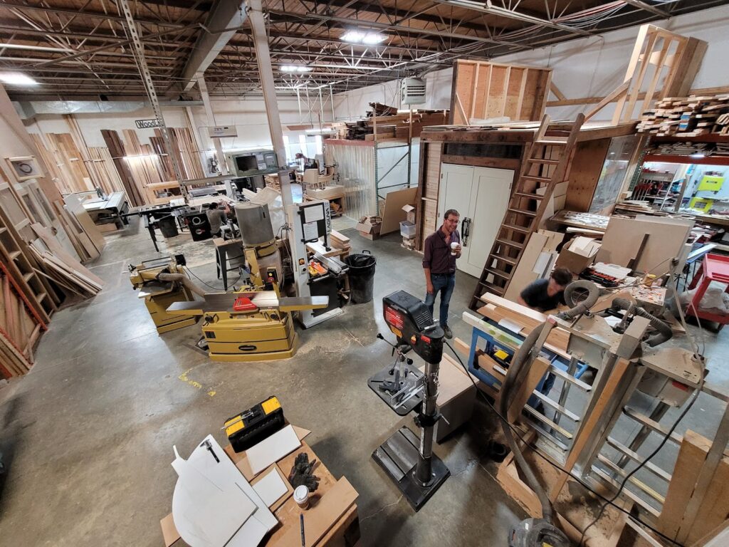
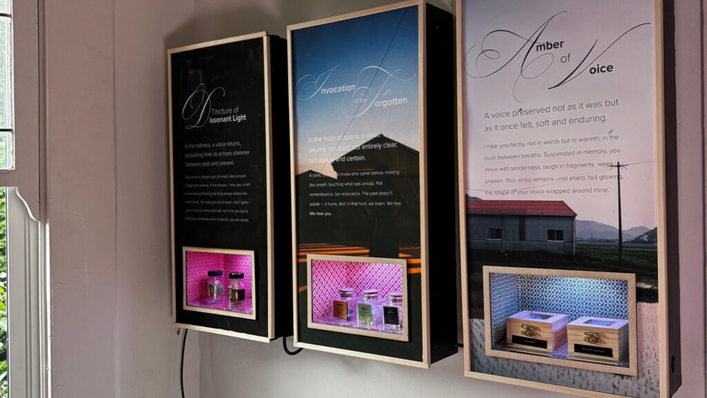
Photographed places and people, never stock and never generated. Cool, overcast, unstyled — the grid below is pulled live from what the site has actually published, so it is a record rather than a mood board.

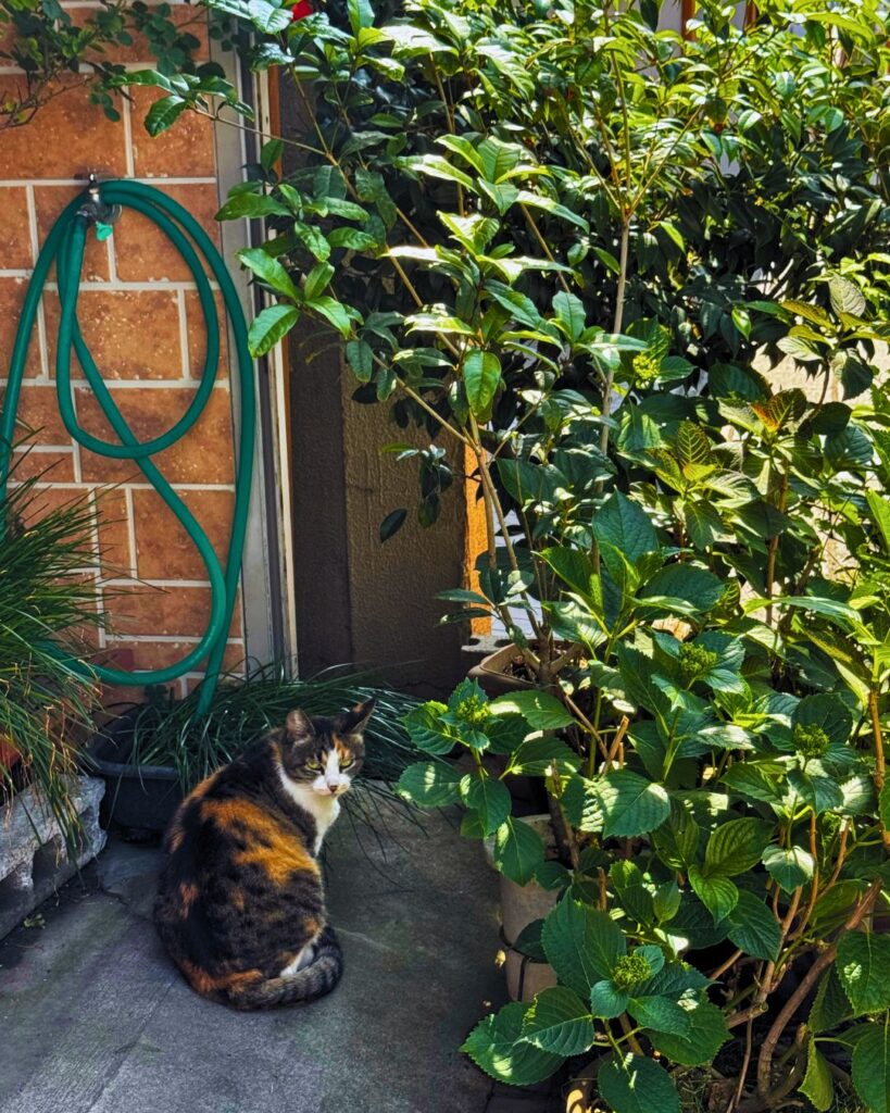



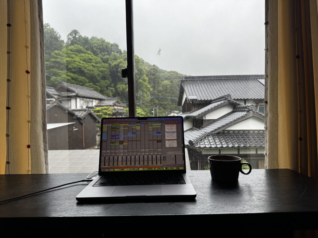


Pulled live from published posts, so this grid changes as the site does.
Texture, used sparingly.
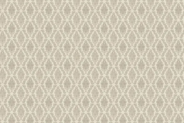
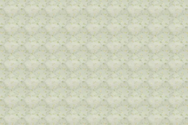
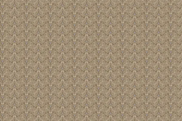
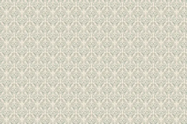
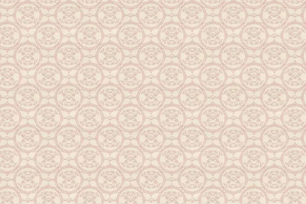
Scanned wallpaper and fabric. These are backdrops, not graphic elements — a way to give one full-width section a different surface from the one above it. Use at most one per page, and put a scrim behind any type that sits on top: none of these hold body copy at an accessible contrast on their own.
The twelve here are the ones inside this system’s warm-neutral range. The full library of fifty runs well past it — crimson, mint, lilac, hot pink — so treat the rest as reference rather than approved surfaces. Every master is a 3000 × 2000 raster, so nothing here scales past 3000 px without softening.



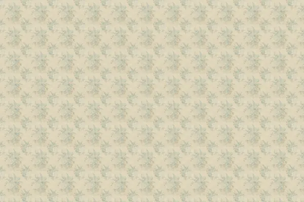
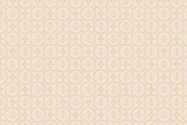


Using one
One section, one pattern, a scrim, and type that behaves exactly as it does everywhere else. The block on the left is the rule followed; the one on the right is the same section with the scrim taken out.
Nothing is louder than the words.
The scrim carries the contrast, so the pattern is doing what it is for — giving this section a different surface from the one above it — without competing for the reader.
Nothing is louder than the words.
The same copy straight onto the scan. The motif runs through the letterforms, the contrast moves with the pattern rather than staying put, and no font size fixes it.
In code that is a background image plus the site’s existing hero scrim — the same three stops .hero uses, not a new value invented for patterns.
.section--pattern {
  background: url("/assets-Patterns/035.webp") center / cover no-repeat;
  position: relative;
}
.section--pattern::before {
  content: ""; position: absolute; inset: 0;
  background: linear-gradient(to top,
    var(--scrim-hero-strong) 0%,
    var(--scrim-hero-mid)   45%,
    var(--scrim-hero-soft) 100%);
}
.section--pattern > * { position: relative; }Phosphor Light.
One family, one weight, no exceptions. Light is the only weight used, because a heavier icon beside this type reads as a different system. Never mix in another set, and never draw a new one — if Phosphor does not have it, the interface says it in words.























Warm neutrals and one forest green.
One green in five steps, a neutral greyscale, and three accents that never touch the interface. Every swatch below is filled by its own token and its contrast measured in your browser on load, so nothing here can drift from the stylesheet without this page saying so.
Surface
What a section sits on. Neutral is the default page; White is for panels raised off it; Dark is the full-width break in the rhythm. White and Neutral are one step apart on purpose — enough to read as raised, not enough to read as a card.
Primary
Five steps of one green, numbered dark to light so the ramp is read the same way round as the greyscale below it. Primary carries type, rules and accents — the quiet structural colour of the brand. It is not the button colour; that is CTA, next.
CTA
Buttons and links, and nothing else. One colour, kept off the Primary ramp on purpose — a call to action that is just a darker shade of the body text is not a call to anything. Use it for the thing you want someone to do, once per view; the moment a second element wears it, neither is the action any more.
CTA is a fill, not a text colour. It sits at 1.06:1 on white, so nothing is ever set in it. Type on a CTA button is CTA dark, and a CTA link on a light page is CTA dark too.
The real .btn and .btn--text, not a drawing of them — these are the same components the site ships.
Greys
Text and edges in one ramp, because they are the same decision. Body, Muted and Muted soft are the three text weights; Grey 4 and Grey 5 are the two border strengths. Muted soft fails AA at body size and is for large text only.
Additional
Illustration and editorial only — never interface, never off-site. None of the three carries enough contrast on Neutral to set text in; they are fills and marks. A layout should feel finished without them.
Semantic
Two states, not three. There is no Success colour: the brand is already green, and a green that sometimes means “the brand” and sometimes means “this worked” costs comprehension both ways. Success is said in words or an icon.
Newsreader for voice. Inter for everything else.
Two families with a hard split: Newsreader carries the writing — headlines, leads, the one editorial italic — and Inter carries everything the interface says. Every specimen below is set in the site’s real classes, so what you see is what ships.
--type-micro-size
--type-display-size
Section heading
.display-h2--type-h2-size
Component title
.h3--type-body-lg-size
Lead paragraph, for openings and introductions.
.lead--type-lead-size
Body copy, the standard reading size used everywhere else.
.body-copy--type-body-size
Editorial accent
.accent--type-italic-size · once per page
Capitalisation
Sentence case everywhere — headings, subheadings, buttons, body copy. Capitalise the first word and proper nouns, nothing else.
Sentence case — use this
Real photos.
A name set in type.
Title Case — not used
Real Photos.
A Name Set In Type.
Capitalising every major word is not part of this system, in any context.
ALL CAPS — a treatment, not a way of writing
Design guidelines
The caps above come from CSS (text-transform: uppercase plus letter-spacing) and are used on eyebrow labels only. The text itself is written in sentence case. Never type words in capitals, and never set a heading, a button or a sentence in caps.
Space. Shape. Depth.
The three scales nobody looks at directly. Spacing sets the rhythm, radius gives every edge its character, and elevation decides what sits above what.
Spacing
A 4px base, doubling early and widening late, so component padding stays fine-grained while the space between sections stays generous. Shown largest first, and read straight out of the token file — including the half-steps, which this page used to leave out.
Radius
Corner rounding scales with the size of the surface. Buttons take 8px, deliberately: the pill is reserved for tags and chips here, which is the opposite of most systems and is what keeps a tag from reading as a button.
Elevation
Quiet by default. A hairline border carries most separation on this site, and a shadow is a response to interaction rather than a permanent state.
One forest fill. Everything else recedes.
Three levels of emphasis: a filled button for the main action, a ghost outline for the secondary one, and a text link for everything else. Aim for one filled button per view. Hover deepens the green rather than changing colour, so the rollover reads the same everywhere.
The system in editorial use.
1:1 quote card built directly from the tokens: Newsreader serif display, single italic accent line, dark hero scrim wash, and green circle monogram mark.