Mel·lif·lu·ous
Design Guidelines
Colour, type and imagery for a practice built around sound, place and curiosity.
Foundation
Music made in unusual places.
The homepage is the visual foundation: expressive serif type, dark space and photographs that open into real stories. The site helps visitors meet Lara, experience the work and follow the ongoing practice.
Purpose
To turn what I hear, remember and encounter into music, and make a place for other people inside it.
Vision
A practice that stays open: to unfamiliar places, new collaborators and different ways of bringing sound to life.
Mission
I compose and perform with violin, voice, live loops and field recordings, developing work through residencies, recordings and interactive sound installations.
Voice & mood
Write in first person for personal stories. Be clear about the work, then leave room for poetry. Keep concrete details: a violin, a bottle, a fish factory, the sound of a place. The established homepage hero remains unchanged.
Audience
Who the work is speaking to.
These practical audience groups guide what the site explains and which paths it makes easy to find.
Listeners and followers
People discovering the music, returning to new work, or following Lara’s practice over time.
Presenters and residency hosts
Curators, venues and hosts looking for a clear sense of the work, its context and how Lara collaborates.
Creative collaborators
Musicians, artists, filmmakers and place-based practitioners exploring a possible shared project.
Logo
A monogram and a name.
Use the supplied horizontal wordmark or circle mark. Choose dark or green artwork on a light surface, and light artwork on a dark surface. Keep the proportions and give the mark room to breathe.






Photography
The places. The people. The making.
Use real photographs from Lara’s practice: residencies, performances, experiments and everyday discoveries. Keep their natural colour and atmosphere. A bright studio belongs here as much as an Icelandic winter. Every photograph below opens its original story.
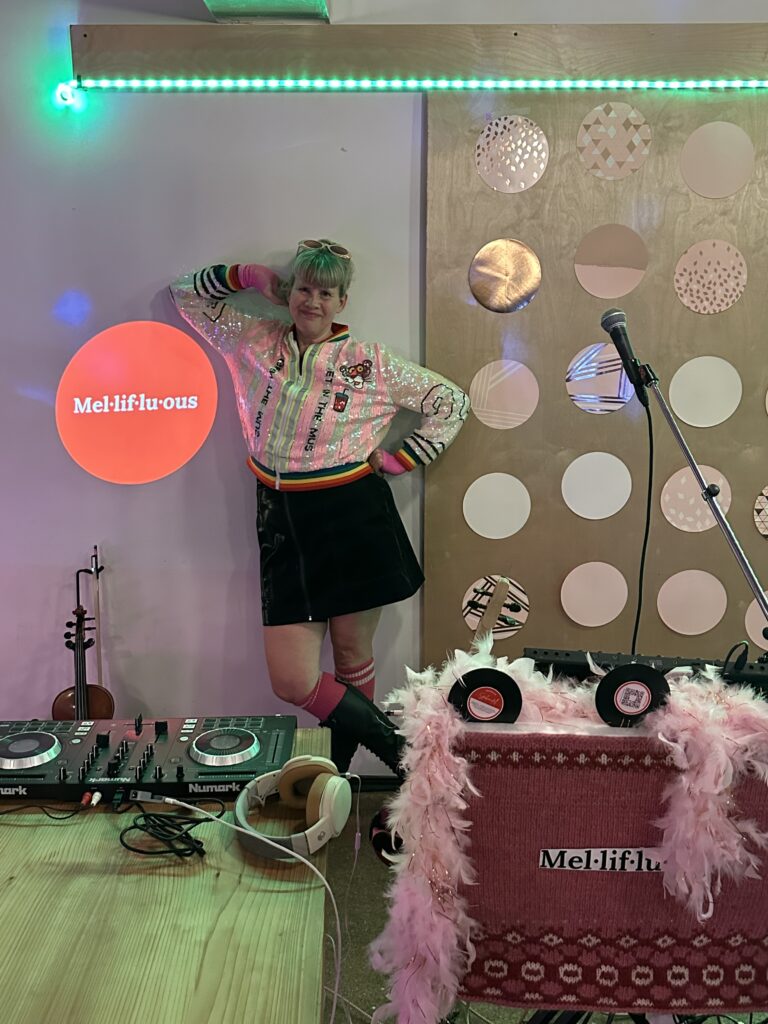
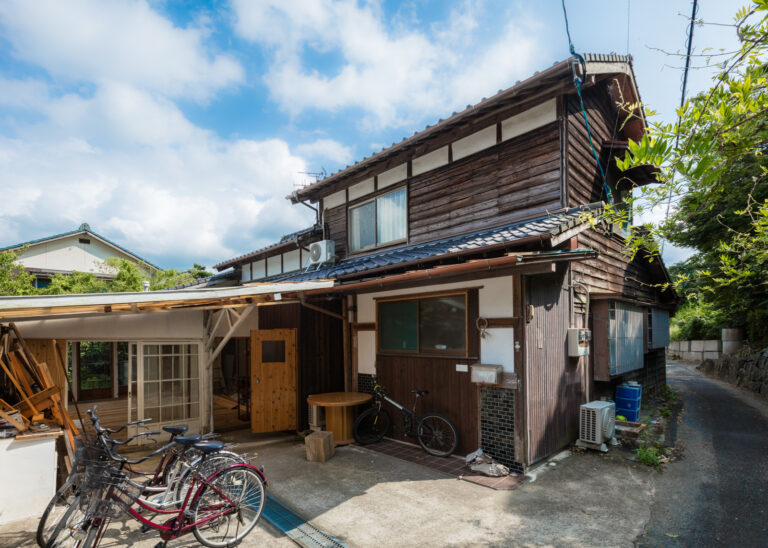
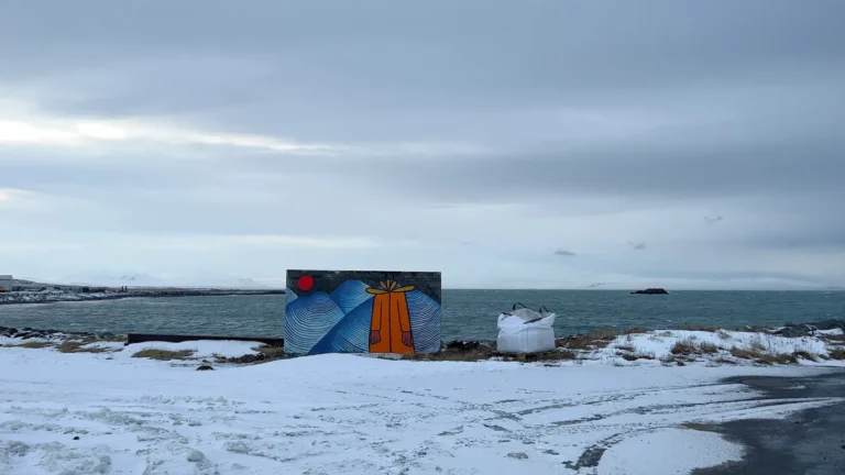
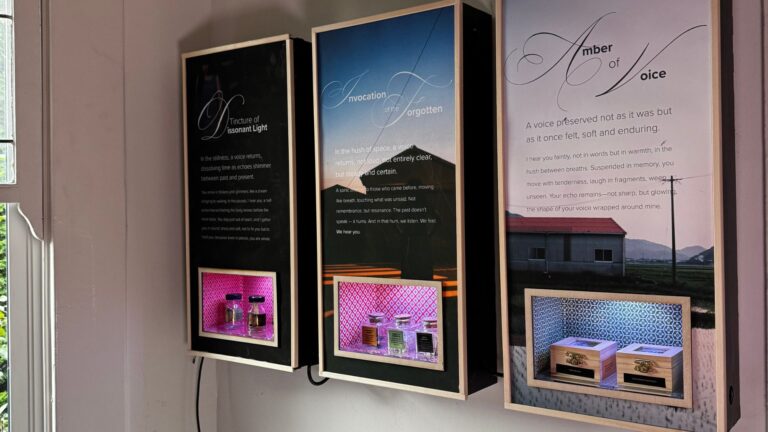
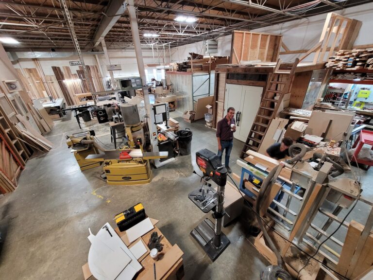

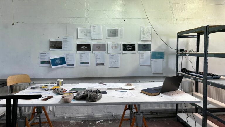
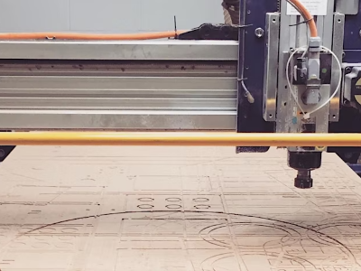
Photography resource
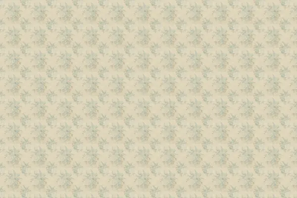
Optional textures.
Supplied wallpaper and fabric scans exist for a future project but nothing on the current site uses them. Keep this section here as a resource, not as instruction to add texture; if a project calls for one, keep text on a readable surface and avoid adding texture simply to fill space. These WebP previews are raster images.





Icons
A light touch.
Phosphor Light supports actions and small practical details. Keep icons subordinate to the photographs and type. Brand marks remain supplied artwork.












Colour
Dark surfaces. Green accents.
The palette supports the photographs. The homepage moves from near-black to progressively lighter charcoal sections. Reading pages and these guidelines use light surfaces. Pale mint marks an action, with dark green text.
Surface
Primary
Grey
CTA
Semantic
Homepage progression
Swatch values come from the shared CSS. Contrast is a relationship between two colours, not a property of a swatch: check the actual text and surface together. Decorative swatches do not establish text accessibility.
Type
Newsreader for expression.
Inter for clarity.
Use these names for visual roles. HTML heading levels follow the content hierarchy, not the visual name — a Title-styled heading can sit at whatever level the page structure calls for. Lead is larger than Body LG. The homepage display remains its approved two-size treatment.
Display
.hero__h1112px above 760px; 56px at 760px and below. Homepage only; intentionally fixed at each breakpoint.
Title
.mel-title--type-h1
H1
The place becomes part of the music.
.display-h2; .mel-section-title--type-h2
H2
.mel-heading--type-h3
H3
.mel-small-heading--type-h4
Lead
.mel-lead--type-lead
Body LG
.hero__lead--type-body-lg
Body MD
.body-copy--type-body
Body SM
.mel-meta--type-small
Eyebrow
.eyebrow--type-micro
Menu
.nav__drawer-link--type-small · mobile drawer, uppercase via CSS
Button
.btnThe actual button component; source: site.css.
Menu: the desktop header uses icon links; the mobile drawer uses the Menu style shown above. Use sentence case in copy, with uppercase applied through CSS to eyebrows and the existing mobile menu. “Design Guidelines” is the shared document title.
Layout
Space. Shape. Depth.
Large images and shorter passages create the rhythm. Alternate generous stories with compact groups. Use whitespace rather than decorative grey separators.
Hierarchy
Keep the hero as the single Display statement. Title is for page covers. H1 is the 32–40px section role, shared by .display-h2, .mel-section-title and the chapter titles inside it. H2 is the 24px .mel-heading role used for the personal introduction, The Art of Becoming, and album/journal card titles. H3 is the 20px supporting heading. Visual names are distinct from semantic HTML: homepage sections remain h2 and their cards remain h3.
Spacing
Use --space-section for stories and content sections, --space-section-compact for the performance and closing invitation, and --space-section-content between an introduction and its grid. Keep heading-to-copy spacing closer than section-to-section spacing.
Reading
Keep prose left aligned and within 54ch. Center only the closing invitation. Balance headings naturally; preserve deliberate line breaks in the opening statement.
Listening
One Bandcamp player serves all three albums: choosing an album swaps the player rather than stacking three embeds. Keep the album picker, the player, and the Story & credits / Open in Bandcamp links together as one unit.
Flow
Hero, personal introduction, the three project chapters (Wildroot & Amber, Spákonufell, Talking to the Trees), performance video, selected listening, The Art of Becoming and process notes, then keep in touch. Each is a distinct section; keep the album clearly identified as a working title.
Surfaces
Follow the --qp-home-* sequence from darkest to lightest. Use light heading and body tokens, mint eyebrows and underlined light links. Keep the gradient on the homepage; guideline specimens and reading pages retain their own surfaces.
Spacing
240px--sp-16220px--sp-15200px--sp-14160px--sp-13128px--sp-1296px--sp-1188px--sp-9_580px--sp-1072px--sp-8_564px--sp-956px--sp-7_548px--sp-840px--sp-732px--sp-628px--sp-6_524px--sp-522px--sp-5_518px--sp-4_516px--sp-414px--sp-3_512px--sp-310px--sp-2_58px--sp-26px--sp-1_54px--sp-12px--sp-0_51px--sp-0_25Radius
--radius-sm--radius-card--radius-pillDepth & lines
Flat surfaces are the default. Keep the 1px outline around complete logo cards, the rule below section links and desktop Foundation dividers. Retain functional borders and visible keyboard focus. Photography supplies depth; extra shadows are not required.
Interface
Quiet controls. Clear feedback.
Keep navigation, media selectors and supporting controls predictable so the music and stories remain the focus.
Navigation
Use clear text labels for destinations. Icons may support a label but must not replace it when the action would be ambiguous.
Keyboard focus
Every interactive element keeps a visible focus state with enough contrast against its actual surface.
Media controls
Choosing an album or video updates one shared player. Keep the active choice obvious and the external listening link nearby.
Motion
Use movement to explain change or create atmosphere, never to delay access. Remove non-essential animation when reduced motion is requested.
Buttons
An invitation, clearly made.
Use the pale-mint button for a primary action. Plain underlined links support reading, listening and downloads. Show a clear label such as “Follow on Instagram” rather than relying on an icon alone.